- AI-Powered · Live in 5–7 Days
The Website That Never Clocks Out
- Live in 5–7 days
- Cancel anytime
- Free upgrades for life
- What's a Smart Website?
Not a brochure. A 24/7 employee.
A normal website just sits there. A Smart Website thinks, writes, talks, ranks, and sells for you — doing the work an entire marketing department used to do, around the clock, while you focus on running your business.
AI Lead Qualification
Answers visitors and qualifies leads in real time — 24 hours a day.
Autonomous Content
Auto-publishes SEO-optimized blog posts that climb Google rankings.
Social & Booking
Posts to social media, books appointments, captures leads automatically.
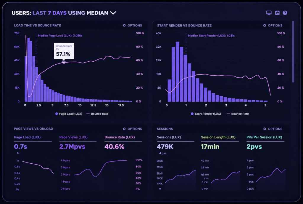
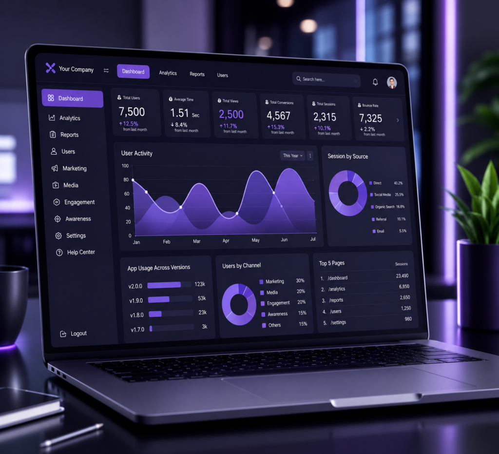
Growth Reporting
Clear monthly reporting on traffic, leads, and revenue impact.
- Our Process
Subscribe to live in one week.
01
Subscribe
Pick your plan and check out securely. You'll get an onboarding form in your inbox the same day.
02
We Build & Train
Our team designs your site, writes your copy, and trains your AI on your services, pricing, and FAQs.
03
Launch & Automate
Your Smart Website goes live in 5–7 business days — then it ranks, engages, and books, automatically.
- 🔥 35% Off — Limited Time
Choose your plan.
StartSmart
- Custom website design
- Professional copywriting
- Hosting & security included
- Mobile-responsive design
- On-demand updates
- AI-ready infrastructure
GrowthEngine
- Everything in StartSmart
- Autonomous blog posting
- AI social media posting (up to 5 platforms)
- AI website assistant
- Analytics dashboard
- Automated content marketing
- Brand voice AI training
Dominate
- Everything in GrowthEngine
- AI receptionist with dedicated phone number
- Complete SEO management
- Technical SEO automation
- Backlink building system
- Lead funnel automation
- Google ranking optimization
- AI lead qualification
- Conversion tracking
- Monthly growth reporting
- 🔒 Secure checkout · Cancel anytime · No setup fees · 100% satisfaction guarantee
- Real Results
Service businesses winning with Smart Websites.
+312%
organic traffic in 90 days
Our AI assistant booked 27 new clients in the first month — completely on its own. We watched leads roll in overnight.Local Home US
27 new Clients / month
#1
Ranked for “Home addition near me”
We replaced our marketing agency entirely. “Dominate” handles SEO, the AI receptionist covers us after hours, and our calendar stays full.Home Renovation Company
3.4× more qualified calls
$180K
in new client revenue from web leads
Our old site was a brochure. This one qualifies leads before they ever reach us — every consultation is genuinely ready to hire.Roofing Contractor
62% lead-to-client conversion rate
- FAQ
Questions, answered.
Don’t see yours? Talk to us.
Most sites launch in 5–7 business days. Onboarding starts the next business day after you subscribe, with design, copywriting, and AI training running in parallel.
Yes — this is launch pricing locked in for the life of your subscription. Once this offer ends, new subscribers pay the full rate. Your price never changes as long as you stay subscribed.
You own your content, copy, and brand assets. The Smart Website platform is subscription-based, which is how we keep it continuously updated and improving without charging you for upgrades.
Absolutely. You can upgrade or downgrade at any time. Upgrades take effect immediately; downgrades apply at the next billing cycle.
None. We handle everything — design, copy, AI training, hosting, and ongoing updates. You fill out the onboarding form; we build the rest.
We can migrate your content, redirect your domain, and replace your existing site, or build alongside it. We’ll walk you through the best path during onboarding.
All major credit cards, debit cards, and ACH bank transfers via Stripe. No setup fees, no contracts.